GIS AH C9: Perbedaan revisi
(→50px Try yourself... Format your new map using the styling tab) |
(→50px Follow along: Load the required files) |
||
| Baris 464: | Baris 464: | ||
In this example we are using the <code>Provinces</code> shapefile. | In this example we are using the <code>Provinces</code> shapefile. | ||
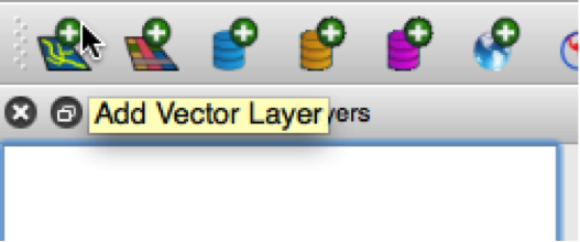
| − | There are two ways in which we can load our table from iSIKHNAS. You already know the first one | + | There are two ways in which we can load our table from iSIKHNAS. You already know the first one - loading layers using the ''Add vector layer button''. |
[[Image:025a.png|image]] | [[Image:025a.png|image]] | ||
Revisi per 17 Oktober 2014 11.45
Daftar isi
- 1 Module: Using QGIS in animal health
- 1.1 Lesson: Putting it into practice - iSIKHNAS
- 1.1.1 Follow along: Create a new map
- 1.1.2 Try yourself... Saving styles
- 1.1.3 Follow along: Selecting records
- 1.1.4 Follow along: Selecting by location
- 1.1.5 Follow along: Inspect the data
- 1.1.6 Follow along: Selecting records using SQL (Structured Query Language)
- 1.1.7 Try yourself... Selection using SQL
- 1.1.8 In conclusion
- 1.1.9 What's next?
- 1.2 Lesson: Projecting layers
- 1.3 Lesson: Buffering
- 1.4 Lesson: Styling to show density
- 1.5 Lesson: Joining two layers together
- 1.6 Lesson: Joining vectors by attribute
- 1.7 Lesson: Working with movement data
- 1.8 Lesson: Loading point data
- 1.1 Lesson: Putting it into practice - iSIKHNAS
Module: Using QGIS in animal health
The purpose of this module is to show how QGIS can be used to assist in animal health scenarios. In order to do this, you will have needed to study, and be familiar with, the previous chapters of this manual, but in particular you need to be familiar with chapters 3 - Creating a basic map, and chapter 7 - Vector analysis.
Lesson: Putting it into practice - iSIKHNAS
In this chapter we are going to use some of what you have learned and apply it to data taken from the ISIKHNAS database.
GIS has become an essential tool in the understanding and management of animal movements and disease. It can provide valuable assistance in a range of tasks, including:
- monitoring animal distribution or movements
- describing the level and distribution of disease
- assessing the efficacy of control programs across space
- developing zones for disease control
- exploring spatially-linked risk factors
- management of animal health emergencies.
This exercise is designed to show you how you can use QGIS in a practical way, using data that you are familiar with.
The goal for this lesson:
Your supervisor has asked you to identify and extract all the cases in the Sulawesi Selatan region, where the species is a type of poultry, and the syndrome recorded is poultry mortality. S/he would like you to provide a map showing where these cases have occurred, and to create a 15 kilometre buffer around the villages in which they have occurred.
In order to do this you will have to:
- load vector shapefile layers and create a new QGIS project
- format the styles appropriately
- subset a dataset spatially using Select by location
- identify particular records in the attribute table using SQL (structured query language)
- save records to a new shapefile
- save layers with a projection suitable for spatial exercises
- create a buffer zone
- use the clip feature to create a layer including only the data required.
For the purpose of these exercises you will be using the shapefiles provided. It is possible to connect directly to the iSIKHNAS database and access the current data however this is beyond the scope of this exercise.
 Follow along: Create a new map
Open QGIS. Using the Add Vector Layer button, add the following layers from the course exercise data, from the folder ISIKHNAS:
SulawesiSul_sthn_distcases_gis
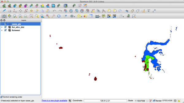
Your map will now look something like this:
The colours will no doubt be different, and probably not suitable. Take the time now to change the style to use the Style tab in the Layer Properties to change the colours to those of your choice. As a refresher:
- Right-click on the layer
- Select Properties
- Click on the Style tab as described above
Here you can change the formatting of the layer in many ways, including colour, fill, symbols, lines, and more.
You can save the colours you choose as styles, so you can easily apply them to other projects.
 Try yourself... Saving styles
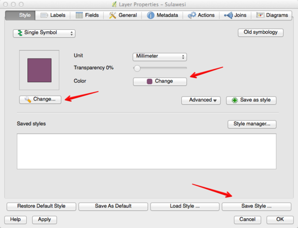
You might want to save a particular colour to be used for your background layer, both in this project and any future mapping projects. To do this, choose the layer you would like to work with, for example Sulawesi. Open the Layer Properties.
Explore your options. As shown in the above image, there are two Change buttons.
The first Change button, with the little spanner, allows you to format items including:
- the symbol layer type
- the colour
- the fill style
- the border colour
- the border style
- the border width
If you only want to change the colour of the layer, click on the second Change button.
Once you are happy with your layer style, click on Save Style ...
Save your new style with a name that will make sense to you later, such as BaseCountry. It is a good idea to save all your styles in the one folder so you can easily find them again.
To use a style you have saved, click on the Load Style ... button.
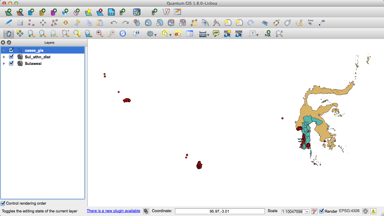
We changed our colours of our layers to this:
There is a very useful website named colourbrewer: colour Advice for Maps found here <http://colourbrewer2.org>' developed by Cynthia Brewer of Penn State. This site contains a lot of useful information about appropriate colour schemes for maps.
Save your work as a new project.
 Follow along: Selecting records
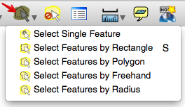
There are several ways of selecting records from layers, including:
- Select Single Feature
- Select Features by Rectangle
- Select Features by Polygon
- Select Features by Freehand
- Select Features by Radius
This are found by clicking on the Select Features by Polygon button, and referring to the drop down menu.
This is a useful tool for selecting one or two features, or quickly drawing around an area. When we want to be more accurate, we can use the Select by Location tool.
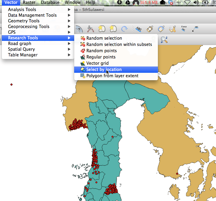
To find the Select by Location tool, click on the menu Vector - Research Tools - Select by location:
By selecting features of one layer that intersect with another, we can create a new layer containing just the features we are interested in.
 Follow along: Selecting by location
Now that we have our map layers loaded into our project, we would like to work specifically with Sulawesi, and in particular, the cases that have been recorded in the Sulawesi Selatan districts. Currently our map shows all the cases recorded throughout Indonesia at the time the data was downloaded.
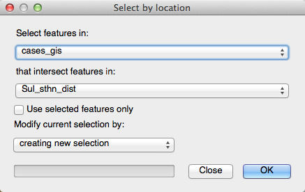
Open the Select by Location. We want to select the features in the cases_gis file that intersect with the Sul_sthn_dist file:
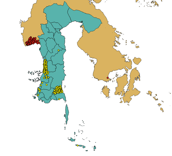
Click "OK' and check your map. You should see that the cases that occur in Sulawesi Selatan are now highlighted:
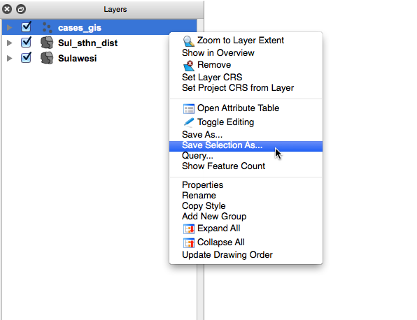
Save this selection as a new layer by right-clicking on the cases_gis layer, and then clicking on Save Selection As...:
Save your new layer as Sul_sthn_cases and add it to your map. If you feel the need, format the colour.
You can now remove the cases_gis layer.
 Follow along: Inspect the data
As mentioned above, you need to extract all the cases of poultry mortality in poultry in the Sulawesi Selatan region. How would you go about doing that?
One answer lies in a layer's Attribute Table. Here you are able to see much more information about each record in the layer. The Attribute Table has been mentioned earlier, particularly in Chapters 3 and 4. Now we are going to use the information contained in the attribute table to select the records we require.
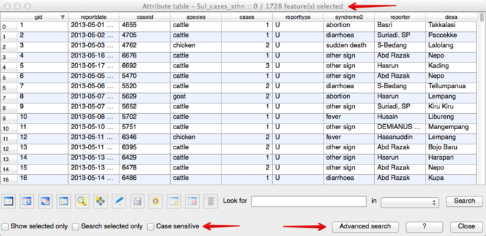
When we open the Attribute Table for the Sul_sthn_cases layer, we see several columns showing information about each record:
What information do you notice?
In this example we can see there are 1728 records in total in this layer. The attribute table has columns containing the following information:
- gid (Geographic identification)
- reportdate
- caseid
- species
- cases
- reporttype
- syndrome2
- reporter
- desa
We can use this screen to find (for example) all the records relating to chickens by typing in chicken in the Look for box, choosing species in the drop down box and clicking on Search. Immediately, all the records with chicken recorded as the species are highlighted in the attribute table.
Note: Notice the Case sensitive option. It is best to leave this box unticked.
That way your search will return results for Chicken and chicken, and any other variations of sentence case.
However, we do not want just chickens, we want all poultry that are recorded with poultry mortality as the syndrome. To select these records, we need to use the Advanced search features.
 Follow along: Selecting records using SQL (Structured Query Language)
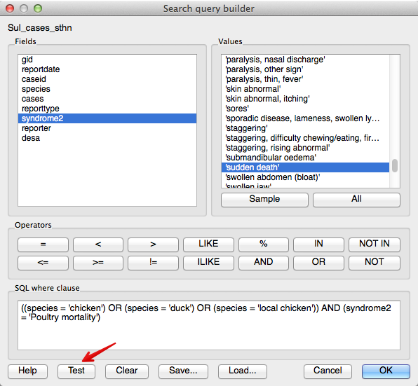
The Advanced search features allow us to create more specific queries, selecting records with the particular attributes we are interested in.
Our query is asking for all the records that contain chicken or duck or local chicken as the species, and a value of "poultry mortality' in the syndrome2 table.
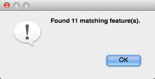
By testing the query, we find that we have 11 matching records:
Click OK in the window saying Found 11 matching feature(s), and click OK in the "Search query builder' window. Note that at the top of the attribute table you will now see the heading Attribute table - Sul_cases_sthn (11 matching features). Click Close on the attribute table.
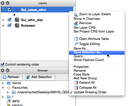
Now that we have our records selected, we will use the Save selection as option that we used before, and save this layer to our map. Right-click on the Sul_sthn_cases layer, and click on Save selection as.
Name this new layer Cases_PoultryMortality and add it to your map.
By turning off the Sul_sthn_cases layer, we can now see the records in the database of poultry mortality recorded in poultry in Sulawesi Selatan.
Note: We have used the Advanced Labeling tool referred to in Section 4.2.1 Using labels to show the labels of each of the districts.
Save your project.
 Try yourself... Selection using SQL
Using the Advanced search features in the Attribute table for the Sul_sthn_cases layer, try selecting specific records according to various combinations.
Do not be afraid to experiment. Try selecting records different combinations such as the date, village, species, syndrome etc.
In conclusion
There are several ways available for selecting data. Which method you choose will depend upon your needs.
Using SQL queries enables you to select records according to the particular attributes that are of interest to you.
What's next?
Now you have your basic map showing where the cases of interest are located. In our next lesson we will review why we are going to need to project our layers in order to develop suitable buffers.
Lesson: Projecting layers
We have created a map showing all the cases of poultry mortality in the Sulawesi Selatan region. Now we need to consider our approach to creating the required 15 kilometre buffer zone around these cases.
The goal for this lesson:
To review map projections
 Follow along: Projecting the layers
Think back to Chapter 7 where you learnt about projections, and now take a look at the layers on your map. Is their CRS (Coordinate Reference System) a Geographic Coordinate Reference System (GCS) or a Projected Coordinate System (PCS)? How can you tell?
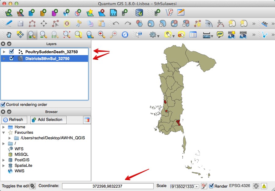
The easiest way is to check the Coordinate box at the bottom of the map canvas. It should be showing longitude and latitude values in decimal degrees, separated by a comma e.g. 120.723,-4.971.
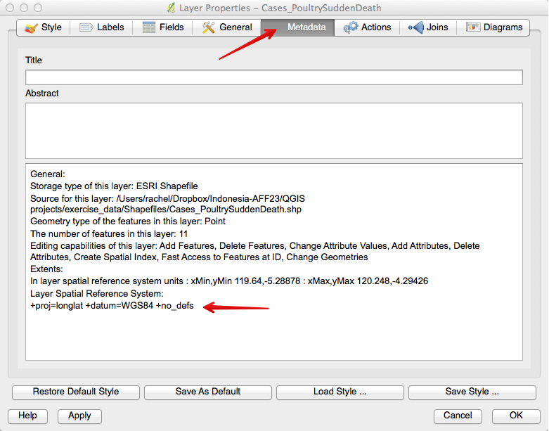
To find even more detail about a layer's CRS, right-click on the layer, and go to Properties, then click on the General tab you will see that the CRS is EPSG:4326 - WGS 84. Even greater detail is seen when you click on the Metadata tab.
As a general rule, if you are going to manipulate spatial data using tools from the Vector menu, your layers will need to be projected to a format where distance is expressed in measurement units such as metres.
For this exercise we will use the Universal Transverse Mercator (UTM) zone 50s (EPSG 32750).
- Right-click on the
Cases_PoultryMortalitylayer in the Layers list. - Select Save As... in the menu that appears. You will be shown the Save vector layer as... dialogue.
- Click on the Browse button next to the Save as field.
- Navigate to the folder you have nominated to store your exercise data and specify the name of the new layer as
PoultryMortality_32750.shp. - Leave the Encoding unchanged.
- Click the Browse button beneath the dropdown.
- The CRS Selector dialogue will now appear.
- In its Filter field, search for
32750. - Choose WGS 84 / UTM zone 50S from the list.
- Click OK.
 Try yourself... Project the remaining layers
Repeat these steps for your remaining layers, adding the new, projected layers to your map. You can now remove the original, unprojected layers from your map. As we have determined that we are only using maps from the areas in Sulawesi Selatan, you no longer need your Sulawesi layer.
The option to project On the fly should be turned off.
Your map should now look something like this:
Note the Coordinate box shows the units in metres instead of degrees.
Save your project.
Lesson: Buffering
Now we have have our layers necessary to create our 15 kilometre buffer. Or do we?
The goal for this lesson:
To consider and understand point data versus polygon data, and how what effect each type will have when creating a buffer zone.
 Follow along: Point data, centroids and polygons
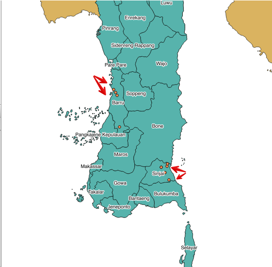
If you look at your map you will notice that the cases of poultry mortality occur mostly in the districts of Barru and Sinjai.
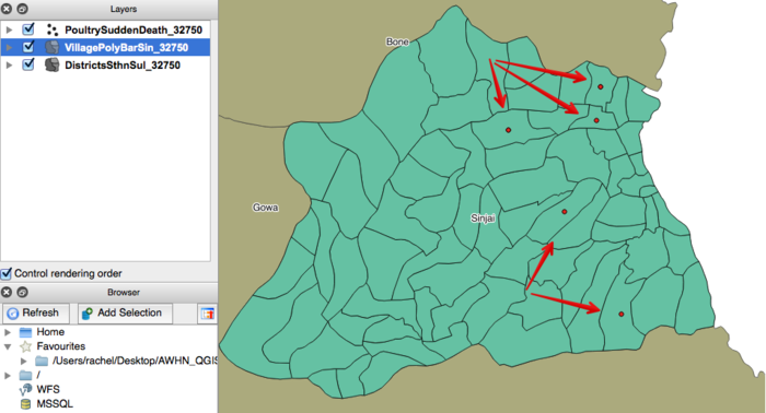
For this exercise we are going to add a new vector layer, VillagePolyBarSin_32750, which shows the boundaries of the village polygons in Barru and Sinjai.
Once you have loaded this layer, arrange the layers so the cases are on top of the village boundaries. Look closely at where the cases lie within the village polygons (you may have to zoom in closer on your map).
What do you notice?
Every case is positioned in the centre of the village boundaries. This suggests they are not the exact coordinates of where the case occurred - all we know is the case occurred somewhere in that particular village. The data is recorded at village level, and it is positioned using the centroid of the village polygon.
How will this affect our 15 kilometre buffer zone? Let's find out.
 Follow along: Buffering from the village centroid
For this buffering exercise we will use the PoultryMortality_32750 file we created. Select this layer, and go to the Vector menu. Hover over Geoprocessing Tools and select Buffer(s).
The following window will open:
Choose PoultryMortality_32750 as the input vector layer, and use a buffer distance of 15000 (remember your layer units are metres).
Click on Dissolve buffer results.
Click on Browse and name your new shapefile PoultryM15kmBuffer_32750.shp.
Add this layer to your map. The result should look something like this:
Do you see that the buffers naturally extend into the sea? We will now use the Clip function to fix this.
 Follow along: Clipping datasets
We can use one dataset to cut through another dataset, leaving us with only the information we want.
In this case, we are going to clip our new buffer layer with the DistrictsSthnSul_32750 layer that you should have created in section 16.2.2 Try yourself... Project the remaining layers.
Note: You may have named it differently, such as Sul_sth_dist_32750.
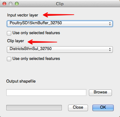
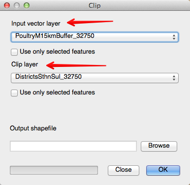
Again, we move to the Vector menu, hover over the Geoprocessing Tools, and select Clip.
Our input layer is the layer we want to change, in this case our new buffer layer. The clip layer is the layer we will use cut around our buffered layer.
Click on the Browse button, and name your new shapefile PoultryM15kmBufferClip_32750.shp.
Add it to the map.
Remove the PoultryM15kmBuffer_32750.shp layer.
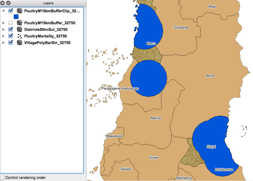
Your screen should now look similar to this:
Our new layer is fitting nicely within the coastlines of South Sulawesi and your supervisor can easily see where the 15 kilometre buffers extend to.
But is this the best buffer zone for the data?
Remember the data suggests the cases are recorded in the database as being in the centre of each village - in reality they are probably taken from anywhere within the village boundary.
This means our 15 kilometre buffers are not going to be as accurate as they might be.
In the next section we will create the buffer using the village polygon layer and compare the two results.
 Try yourself... Buffering using the village polygon
Using the same skills you have learnt above to buffer and clip layers, create a 15 kilometre buffer zone around the village polygons containing cases of poultry mortality. Clip your new layer and add it to your map, naming it PoultryM15kmBufferPolyClip_32750.
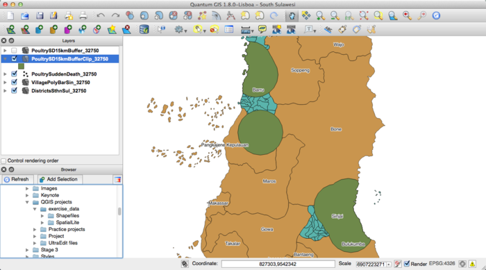
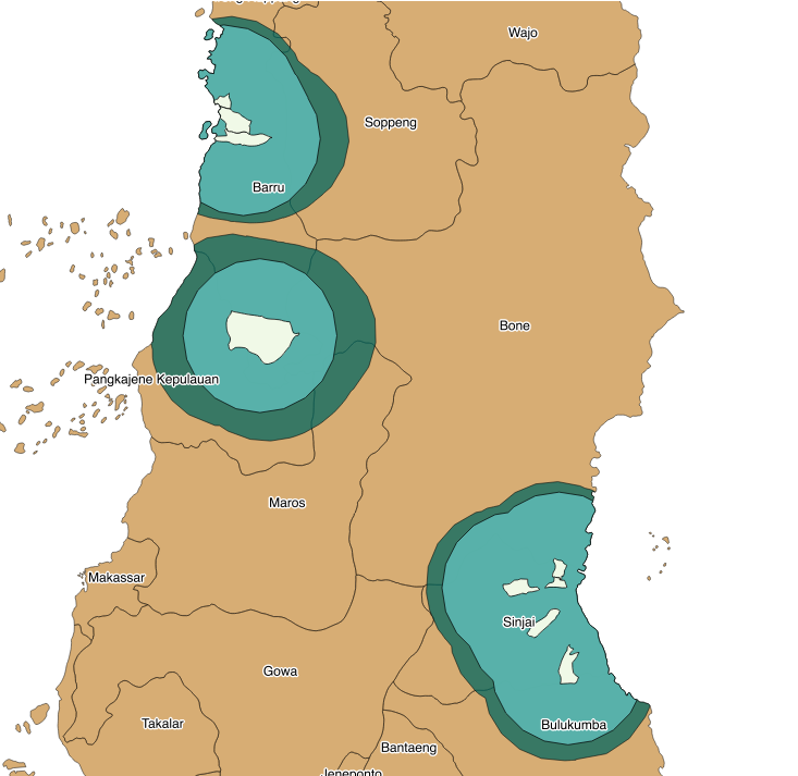
Rearrange the layers, so that the buffer zone created with the village centroids is visible over the top of your new buffer zone created with the village polygons. What do you notice?
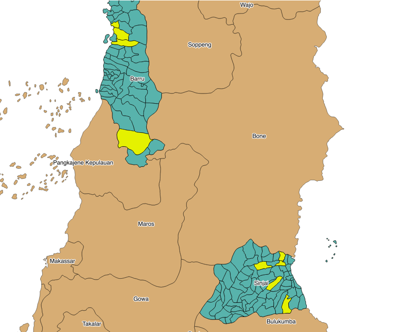
In this picture, the dark green shows the buffer zone around the village polygons (shown in the light colour). The lighter green shows the buffer zones created using the case data points.
Since we don't know exactly where each case occurred, it is a good idea to consider using the village polygons when creating a buffer zone, not the village centroids.
What's next?
It would be useful if we could estimate by looking at our map how many cases have been recorded in each village. In our next lesson we will review more styling, and how to colour areas according to particular attributes we wish to display.
Lesson: Styling to show density
[animalhealth/exercise4::doc] A good map is able to convey information quickly and clearly. For example, we can use colour to indicate the number of cases in each village of the particular syndrome we are investigating.
The goal for this lesson:
To review ways of styling our maps so the information is displayed in the clearest possible way.
 Follow along: Styling to show density
Open the PoultrySuddenDeath_32750 attribute table and have a look at the columns. What do you notice? What information can you easily display on your map?
Take a look at the cases column. It tells you the number of cases recorded in each village. We can use colour coding to display this information on our map.
To do this, open the layer properties for PoultrySuddenDeath_32750 and click on the Style tab.
Select Graduated from the pull-down rendering menu. This spreads our chosen colours from light to dark, or dark to light.
Set the Column to cases, and the Classes to 5.
The colour ramp can stay at blue for now, and the Mode can be set to Equal Interval. QGIS should immediately provide a set of five blue colours, with five equally spaced intervals. (If not, click on Classify).
Click on Apply to see how this looks on your map.
What do you notice?
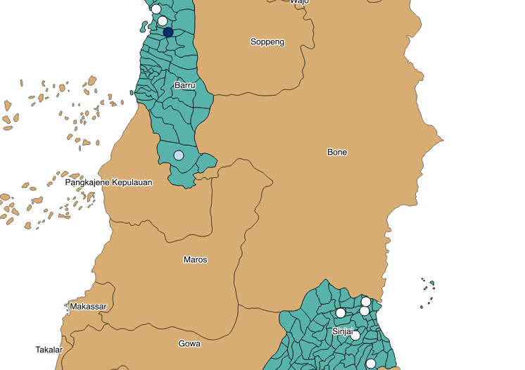
Our points on the map are very small, and it is difficult to distinguish the colour variation. One way to change this is to experiment with the size of the points.
To do this, open the layer properties for PoultrySuddenDeath_32750 and click on the Style tab again. This time, click on the change button next to Symbol. Experiment with the size of the point until you think it is large enough to show the varying shades.
This is what it looks like when the size is set to 5 millimetres:
What's next?
This improves our map for showing which villages have recorded the most cases, but it would be better if we could show this using the village boundaries.
In our next lesson, we will learn how to join layers together by their location. This will enable us to create a new file that combines attributes such as the case numbers from the PoultrySuddenDeath_32750 shapefile and the village boundaries from the VillagePolyBarSin_32750 shapefile.
Lesson: Joining two layers together
There are two ways we can join layers together:
- we can use the Join by location tool to create a new layer combining the attributes from two different layers, or,
- we can join using a single matching attribute.
The goal for this lesson:
To use create a new shapefile using the Join by location tool
To display information from a non-spatial file on a spatial file, by joining the two using a common data field.
 Follow along: Join attributes by location
In the last lesson we reviewed how to use colour to show the density of case records in each village however the results were not really adequate because our file containing the case records shows them on the map as point data. We would really like to colour the entire villages as shown in the file containing the village boundaries. We can't do this using the file as it is, because it does not contain the cases information. We need to join the two files using the Join attributes by location tool, located under Data Management Tools in the Vector menu.
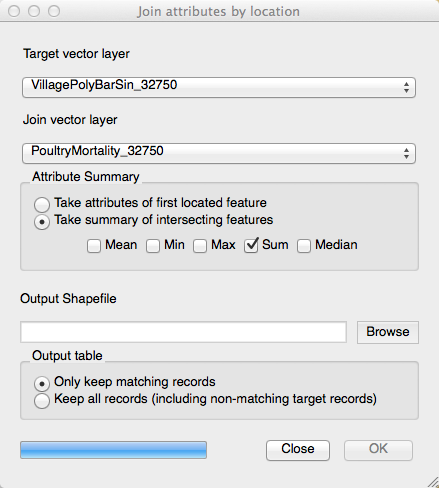
Use the VillagePolyBarSin_32750 file as the Target vector layer, and the PoultryMortality_32750 file as the Join vector layer:
- Click on Take the summary of the first located feature under Attribute Summary
- Tick the Sum box underneath.
Browse to where you are going to save your file, and name it appropriately (we used PoultryMJoinLocation_32750).
Only keep the matching records. Click OK and add the new layer to your map.
Close the Join attributes by location dialogue box.
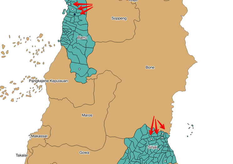
Your results should look similar to this:
Now open the Attribute table of your new layer. You can see that the new layer has the attributes of each original file, including the number of cases. We can now use this to improve our depiction of case density on the map.
 Try yourself... Style the villages to show the density of recorded cases
Using the skills from the previous lesson, amend the style to show the case density in each village. Experiment with the effect of choosing different intervals:
- Equal Interval: Divides your data into equally-spaced groups.
- Quantile: Uses an equation to divide values into equal-sized subsets.
- Natural breaks (Jenks): Tries to minimise differences within classes whilst maximising the difference between classes. Standard deviation: Illustrates how values deviate from the average.
- Pretty breaks: Breaks the values into classes that are easily understood by non-statisticians.
Explore the effect of each of these, using Apply to see the changes each makes to your map.
Lesson: Joining vectors by attribute
For this exercise, we would like to join a file from the iSIKHNAS database, with no associated spatial data, with a shapefile that does have geometric data. By doing this, we can display the data from the iSIKHNAS file on a map of Indonesia.
The goal for this lesson:
Your supervisor would like the data in a report from iSIKHNAS displayed on a map of Indonesia.
The problem you face is there isn't any spatial data associated with the data file.
To display the data for your supervisor, you are going to have to join the data file to a file that contains spatial data (such as a shapefile) and can be displayed.
 Follow along: Load the required files
Load the particular shapefile you wish to use. This could be:
Provinces
Districts
Sub-districts
In this example we are using the Provinces shapefile.
There are two ways in which we can load our table from iSIKHNAS. You already know the first one - loading layers using the Add vector layer button.
In this scenario, you might download the data file you need as a .csv file from the iSIKHNAS website.
Save the .csv file in a folder where you will find it again.
Upload it to QGIS using the Add vector layer option.
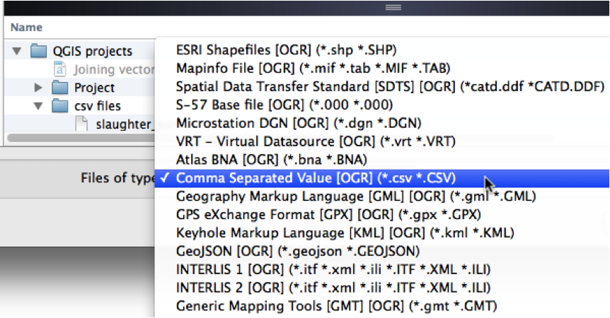
Remember to choose the correct file type (in this case .csv). Otherwise it may default to shapefiles, and you will not be able to choose your .csv file.
Or, you might want to load your own Excel file that you have been working with. From QGIS 1.8 onwards, you are able to load an Excel file directly into QGIS as well.
Note: QGIS 1.8 will import Excel files saved as .xls, NOT in the newer .xlsx format.
If you are using QGIS 2.0 onwards, it should be able to import an .xlsx file.
The second way is using the supplied user login details to connect directly with the database.
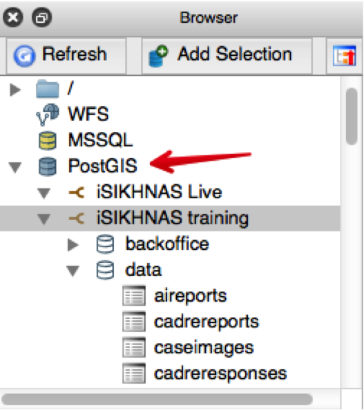
In this example we have used the rph_prov_week_gis_centroid table, from the iSIKHNAS training database.
We have found this by scrolling through the available tables.
Double-click on the table and it will load in QGIS.
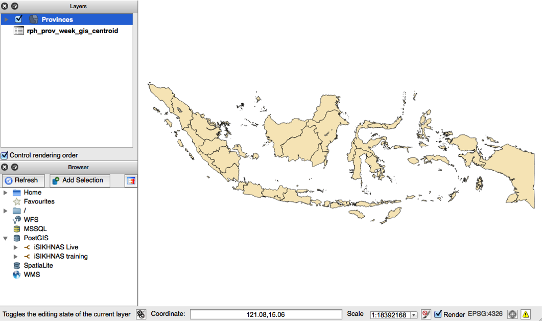
Our example QGIS project now looks like this. Save this as a new project.
 Follow along: Compare the loaded files
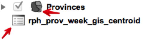
Look closely at the Layers window, and the two files shown there.
What do you notice?
The layer for the provinces can be displayed in QGIS, and therefore must contain spatial data. We know this from the little polygon icon next to the file name, and the little tick box beside it.
The layer for the slaughter statistics does not contain spatial data. It is a table only and cannot be displayed. We know this from the little table icon next to the file name, and there is no tick box.
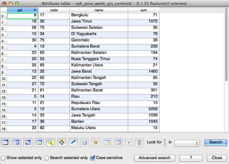
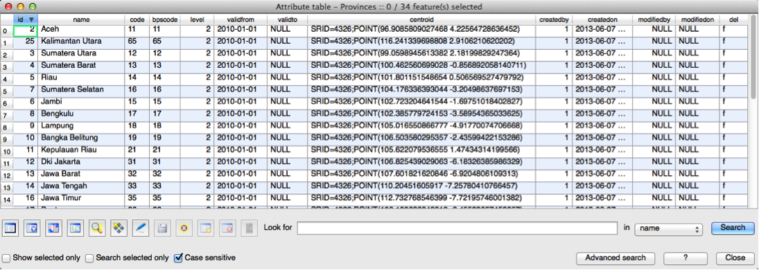
Now compare the attribute tables for rph_prov_week_gis_centroid and Provinces.
What do you notice?
Both files contain an identical field code (this is the unique code for each location).
The code field is the field we can use to join these two layers together. By creating a join, we can display the attributes from the rph_prov_week_gis_centroid file with the images from the Provinces shapefile.
 Follow along: Joining files
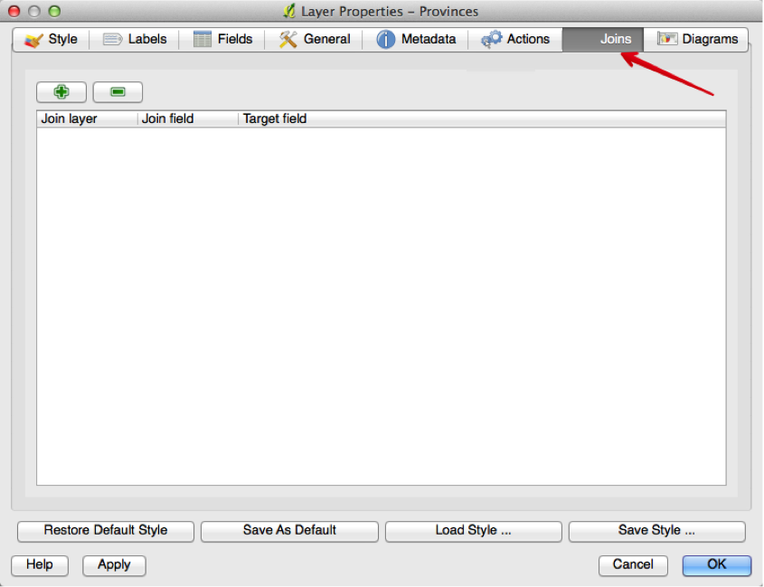
Right-click on the Provinces shapefile and open the layer Properties. Click on the Join tab as shown below:
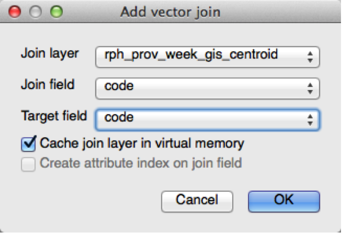
Click on the green plus sign, to open this window:
The join layer is the rph_prov_week_gis_centroid file.
The join field is the field in the rph_prov_week_gis_centroid file that we are going to use to join the two files. In this case, we are going to use the field code. This is selected from the drop down list.
The target field is code again "“ this is the field in the Provinces file that has matching data to the code field in the rph_prov_week_gis_centroid file.
The names of these fields do not necessarily have to match, but the information contained in each field must refer to the same attribute.
For example, one file might use the name code and the other file might use the name location_code. We can still join the two files as long as the data itself is identical.
In this case we are referring to the code given to each location.
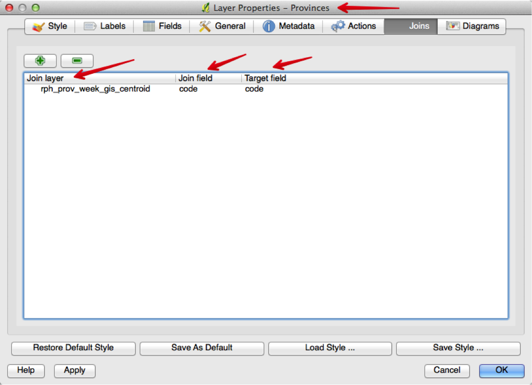
Click OK.
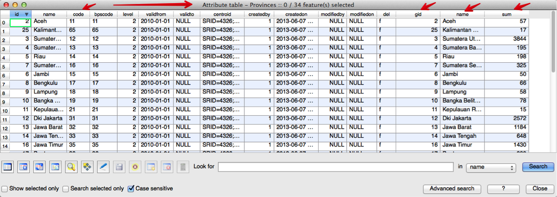
Now open the attribute table for the Provinces shapefile again.
What can you see?
The attributes from the rph_prov_week_gis_centroid:kbd: file (gid, name, and sum) are now in the attribute table for the Provinces file. The
We can now use this to map the data from the rph_prov_week_gis_centroid file on the Provinces image.
 Try yourself... Format your new map using the styling tab
Using the skills you learnt earlier about style formatting, look for ways that will display your data in a way that is helpful.
For example, we can now format our map to show density, because we have the sum of the number of animals slaughtered in our new attribute table.
Our rph_prov_week_gis_centroid file contained summary slaughter statistics for each province.
By joining this file with the Provinces file, we are able to format the style to indicate the numbers of animals slaughtered in each province.
In conclusion
It is possible to display the information in a data file that does not contain spatial data by joining it to a file that does contain spatial data.
Both files must contain an identical data field in order to join the two files.
The headings of the two fields do not have to be the same, just the data contained in those fields.
What's next?
In our next, and final, exercise, we will investigate some of the movements data (showing livestock moving from one place to another). Here we will work through a simple and practical exercise as another example of an actual task that you may be asked to complete.
Lesson: Working with movement data
iSIKHNAS collects many types of data. One of these is movement data, showing the movement of livestock from one place to another.
The goal for this lesson:
To create a map that clearly shows livestock movements.
Your supervisor would like you to extract a dataset of poultry movements between certain dates. S/he would then like you to create a map that shows:
- Poultry movements between 1 December 2013 and 31 December 2013
- Format the style to clearly show density
 Follow along: Selecting data using SQL
For this exercise, start a new project. Load the following shapefiles supplied in your data folder:
Indonesia_32750Sulawesi_dist_32750movements_32750
Use the Layer Properties to style the layers as necessary like you have done in the exercises.
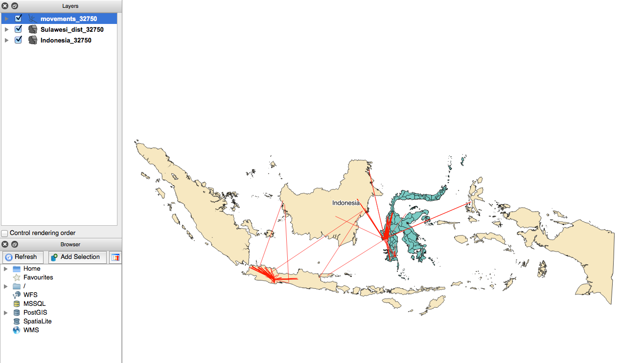
Your new map should look similar to this:
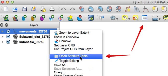
Open the Attribute table for the Movements_32750 layer. You can do this by either right-clicking on the Movements_32750 layer, and selecting Open Attribute Table, or you can click on the icon in the menu bar as shown below:
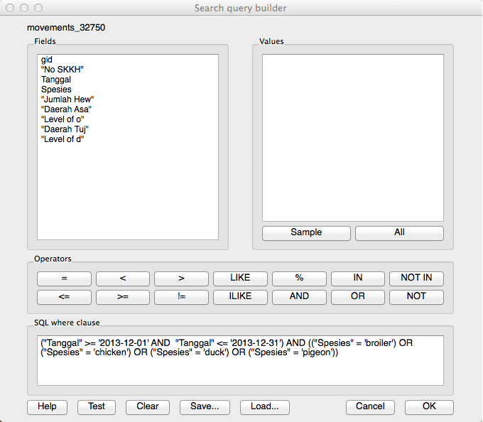
Here we will select the records we want using SQL. Open the Advanced search option. You want to select all records relating to poultry, that are between 1 December 2013 and 31 December 2013.
To do this, you need the following query:
("Tanggal" >= "2013-12-01" AND "Tanggal" <= "2013-12-31') AND (("Spesies" = "broiler") OR ("Spesies" = "chicken") OR ("Spesies" = "duck") OR ("Spesies" = "pigeon"))
This query is asking to return records:
Between the two dates: ("Tanggal" >= "2013-12-01" AND "Tanggal" <= "2013-12-31")
AND
With the following species:
(("Spesies" = "broiler') OR ("Spesies" = "chicken') OR ("Spesies" = "duck') OR ("Spesies" = "pigeon"))
If you test the query, it should return 30 records:
Close the attribute table. Your selected records should be highlighted in yellow on your map.
Right-click on the movements_32750 and choose the Save selection as option. Save your new layer with an appropriate name such as movements_poultry_32750. You can now remove the movements_32750 layer.
When you look closely, you will see that all the movements take place in Sulawesi. If you like, you can remove the layer Indonesia_32750.
In the next section we will review styling again, and show density in our movement data.
 Follow along: Style formatting
Our movements data for is now showing on the map, but it doesn't really tell us too much about it. We can use styling to show more.
Right-click on your new movements_poultry_32750 and click on the Style tab.
As you have learnt previously, here you can style your layer to show attributes such as density. You can also:
- colour the movement lines according to the number of animals in each movement (density)
- increase the width of the movement lines to show the number of animals in each movement
- layer the movement lines so thinner lines are displayed on top of the wider lines
 Try yourself... Style formatting
Review Section - Styling to show density and Section - Style the villages to show the density of the recorded cases.
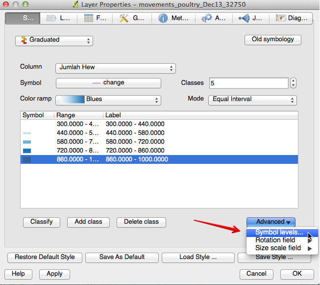
Format the movement lines using colour to show the number of animals in each movement. The column you will use is Jumlah Hew.
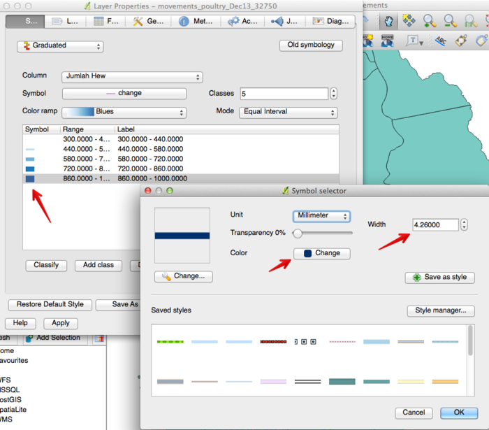
Once you have your individual lines, you can double-click on each one and a new window will open. Here you can edit your line for things such as width, colour, transparency:
Experiment with the width of each line until you are happy with your results.
After changing the width of each graduated line, you will then be able to order the lines so the widest lines appear underneath the thinnest ones.
Still in the Layer properties window, click on Advanced, and then Symbol levels:
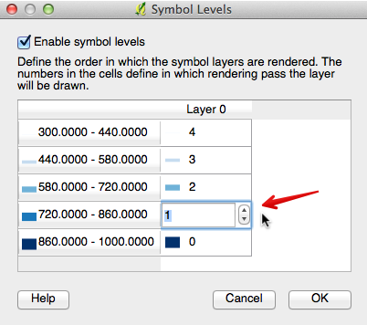
This opens up a new window, where you can order your symbols:
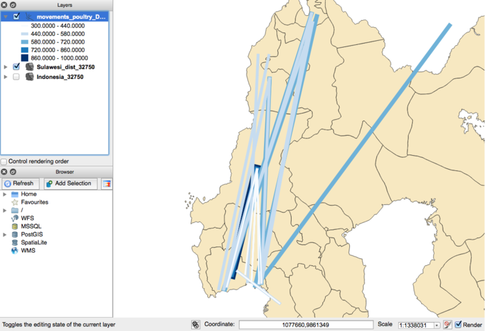
When ordering symbols, the first symbol to be placed on the map is the one with a zero. In the image above, you can see that our widest line is a zero, and the narrowest line is a four. The result is this:
This shows our lines formatted using colour and line width to show the number of animals in each movement. The darker, thicker line shows us there were between 860 and 1000 birds moved in this particular movement.
What's next?
Our final lesson is to show how to load another type of data into QGIS. Sometimes you will receive data as a spreadsheet, or you might download it from a source such as a database as a CSV file. We will now show you how to load this type of data into QGIS.
Lesson: Loading point data
We have worked with data in the form of shapefiles, raster files, and directly from databases. Sometimes your data will be in an Excel spreadsheet, with longitude and latitude. It is important that you know how to load data when it is in this format.
The goal for this lesson:
To load and plot data from a spreadsheet.
 Follow along: Loading a Delimited Text File
For this exercise, you will begin a new project.
We have worked with data in the form of shapefiles, raster files, and directly from databases. Often you might receive data in the form of a spreadsheet, so it is important to know how to load this data into QGIS.
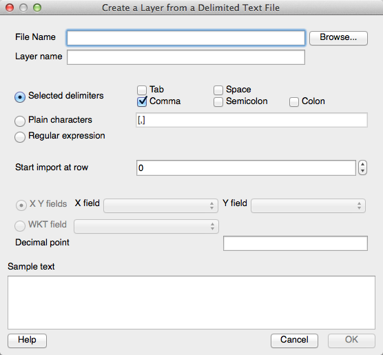
Data is supplied in this way is often in a CSV file, which is a delimited text file. To load these types of files, we will use the "Add Delimited Text Layer" plugin:
Click on this button, and the following dialogue will open:
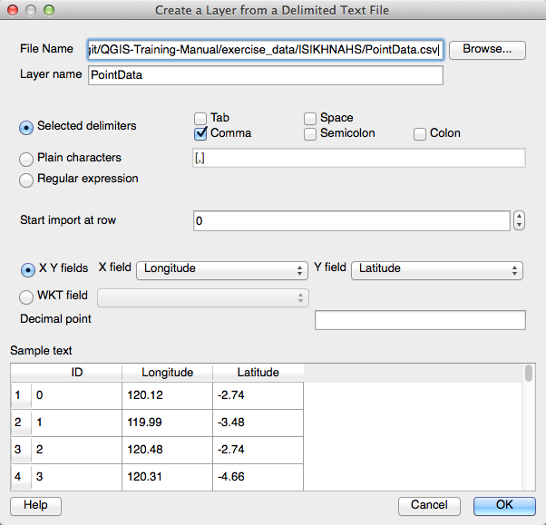
Browse to the course exercise data, and load PointData.csv from the folder ISIKHNAS. This is just randomly generated point data to use for this exercise.
The plugin does a very good job of reviewing the information contained in the file, but you will need to give it some guidance. In this file, the delimiter is a comma, so we need to select "Comma" as the delimiter.
Your dialogue box now looks like this:
Click on the OK button. You will now be asked to specify the CRS. This should make you think about what format the data was collected in. For now we will select WGS 84 EPSG:4326. Click OK.
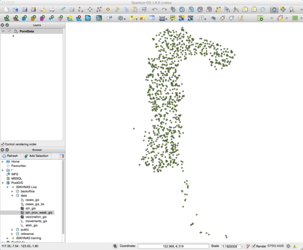
You should have a layer similar to the following image:
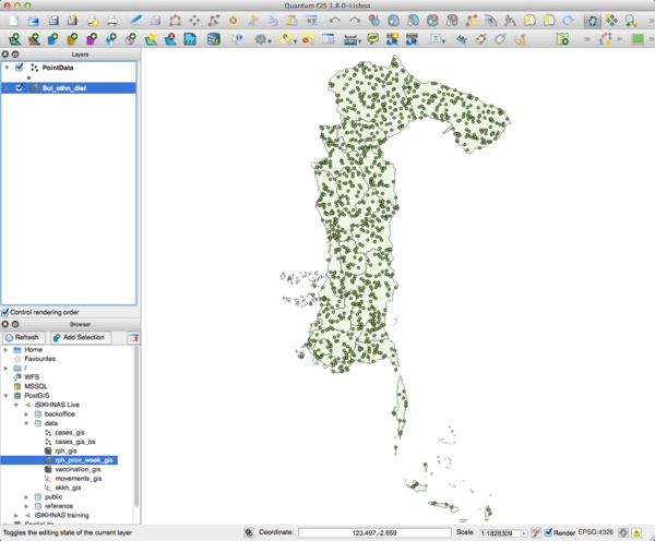
This shape should look familiar - load the shapefile Sul_sthn_dist, and rearrange the layers so the point data is the top layer.
You should now see something like this:
In conclusion
This chapter has been designed to show you how to use QGIS in a practical and useful way, using real data obtained from the iSIKHNAS database. The exercises have been developed to show examples of actual tasks you may be asked to carry out by your supervisor.
It is only a small example of what you can do using the QGIS software. If you are interested, do not be afraid to explore the software. Use the internet to search for new ways to create particular maps, or investigate different ways of doing things.
Click here to go to the Answer sheet

