GIS AH Answers
Daftar isi
Answer Sheet
Results for Adding Your First Layer
 Preparation
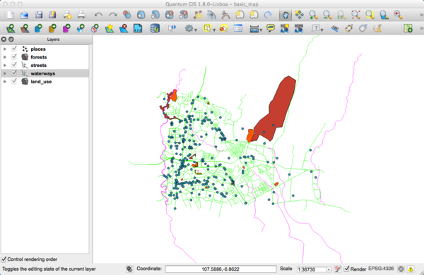
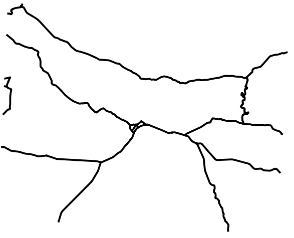
You should see a lot of lines, symbolizing roads. All these lines are in the vector layer that you just loaded to create a basic map.
Results for An Overview of the Interface
 Overview (Part 1)
Refer back to the image showing the interface layout and check that you remember the names and functions of the screen elements.
 Overview (Part 2)
- Save as
- Zoom to layer
- Help
- Rendering on/off
- Measure line
Results for Working with Vector Data
 Shapefiles
There should be three layers on your map:
- waterways
- places and
- streets.
 Databases
All the vector layers should be loaded into the map. It probably won't look nice yet:
(We'll fix the ugly colours later.)
Results for Symbology
 colours
- Verify that the colours are changing as you expect them to change.
- It is enough to change only the waterways layer for now. An example is below, but may look different depending on the colour you chose.
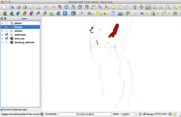
Note: If you want to work on only one layer at a time and don't want the other layers to distract you, you can hide a layer by clicking in the check box next to its name in the Layers list. If the box is blank, then the layer is hidden. We have hidden some of the layers in this picture.
 Symbol Structure
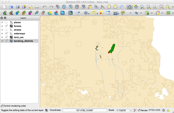
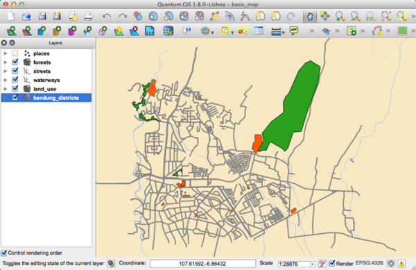
Seen together, your forests, waterways, and bandung_districts layers should look more or less like this:
If you are a Beginner-level user, you may stop here.
- Use the method above to change the colours and styles for all the remaining layers.
- Try using natural colours for the objects. For example, a road should not be red or blue, but can be gray or black.
- Also feel free to experiment with different Fill Style and Border Style settings for the polygons.
 Symbol Layers
- Customize your layers as you like, but remember that it has to be easy to tell different layers apart on the map.
Here's an example:
 Symbol Levels
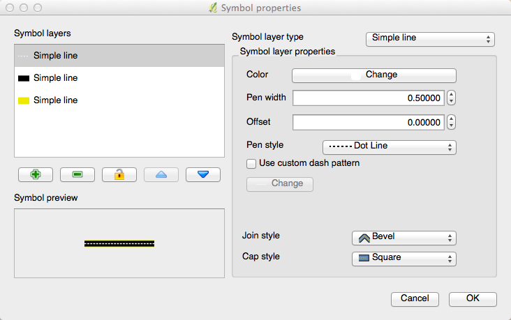
To make the required symbol, you need at least three symbol layers:
The lowest symbol layer is a broad, solid yellow line. On top of it there is a slightly thinner solid dark gray or black line. The symbol layer on top is a thin white dashed line.
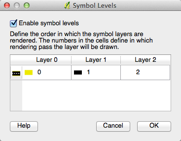
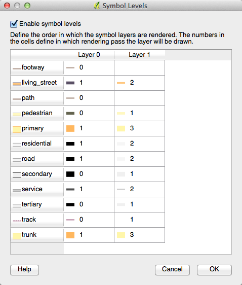
- If your symbol layers resemble the above but you're not getting the result you want, check that your symbol levels look something like this:
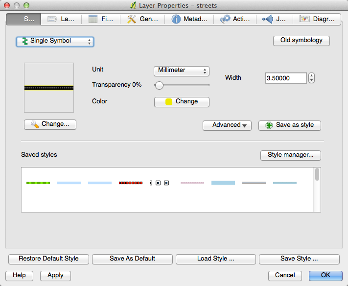
- Now your symbol should look like this:
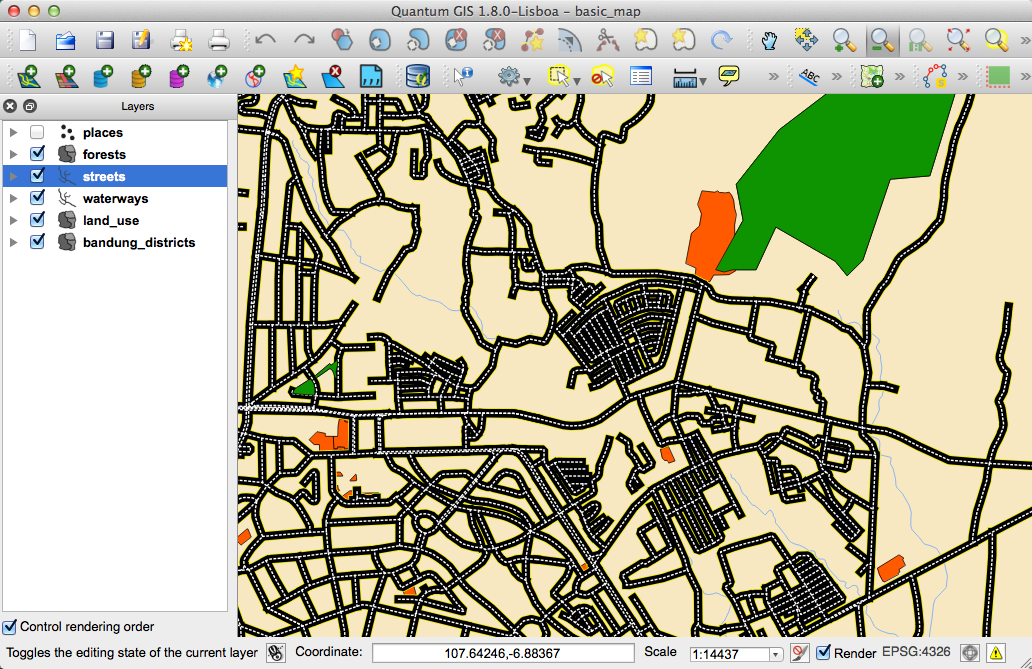
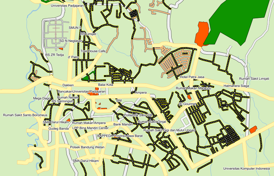
- Which, on the map, gives you this kind of effect:
 Symbol Levels
- Adjust your symbol levels to these values:
- There are a lot of symbols with this style
- Experiment with different values to get different results.
- Open your original map again before continuing with the next exercise.
Results for Attribute Data
 Attribute Data
The NAME field is the most useful to show as labels. This is because all its values are unique for every object, and it contains no "null" values (i.e., fields with no value).
Results for The Label Tool
 Label Customization (Part 1)
Your map should look like this:
 Label Customization (Part 2)
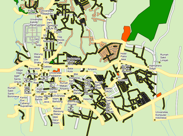
One possible solution has this final product:
To arrive at this result:
- Use the font type
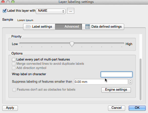
Arialof size10and a Label distance of1,5 mm. - In addition, this example uses the Wrap label on character option:
- Enter a
spacein this field and click Apply to achieve the same effect.
 Using Data Defined Settings
- Still in edit mode, set the
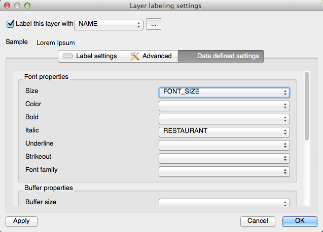
FONT_SIZEvalues to whatever you prefer. The example uses14for universities,12for hospitals, and10for the remaining places. - Remember to save changes and exit edit mode.
- In Data defined settings, do this:
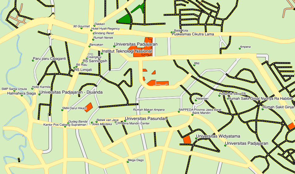
Your results, if using the above values, should be this:
Results for Classification
 Refine the Classification
- Use the same method as in the first exercise of the lesson to get rid of the lines:
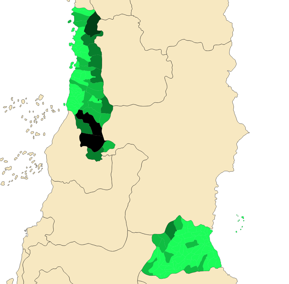
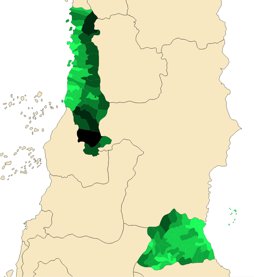
The settings you used might not be the same, but with the values Classes = 7 and Mode = Natural Breaks (Jenks) (and using the same colours, of course), the map will look like this:
Results for Vector Analysis
 Find Important Roads
Your layer should now have these roads:
- Save this new layer (the same way you did before) under
exercise_data/residential_development/, asimportant_roads.shp. - Once the new layer has been added to your map, remove the old layer.
- If for some reason it gives you an error message saying that it can't add the layer to the map (this can happen), remember that you can add the layer yourself by using the Add Vector Layer button as you did before.
 Distance from High Schools
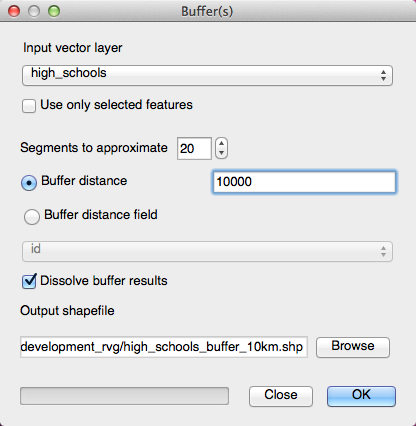
- Your buffer dialogue should look like this:
The Buffer distance is 10000 meters (i.e., 10 kilometers).
- The Segments to approximate value is set to
20. This is optional, but it's recommended, because it makes the output buffers look smoother.
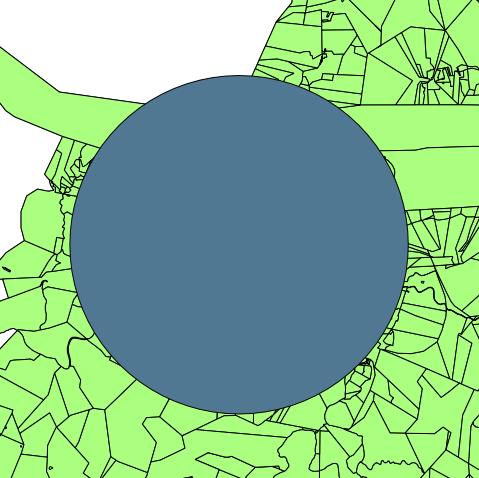
Compare this:
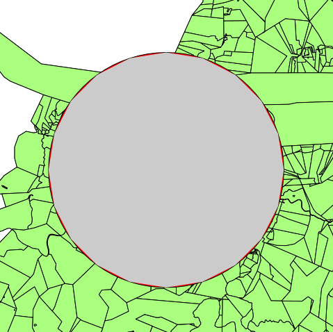
To this:
The red circle is the buffer with Segments to approximate set to 20; the gray circle on top of it is the buffer with Segments to approximate set to 5.

