Case Study 2
Daftar isi
- 1 Case study 2: Seasonal prevalence of diarrhoea (Mencret) in cattle
- 1.1 Introduction to case study
- 1.2 Skills to be developed during this case study
- 1.3 List of files for case study
- 1.4 Steps in analysis of Case study 2 (exercises)
- 1.5 Summary of case study 2
Case study 2: Seasonal prevalence of diarrhoea (Mencret) in cattle
Introduction to case study
Diarrhoea is a clinical sign of many serious production diseases, for example internal parasites. Here we will examine the prevalence of diarrhoea in cattle throughout the year to determine if there is a seasonal peak in the amount of diarrhoea. This will allow you to plan for Mencret. For example we can identify if and when an annual peak of cases is observed each year. This may allow you to request anthelmintic supplies before the peak or implement a preventative plan in advance of the seasonal peak. The relevant data is Cattle clinical signs.
It is important to note that the data used in this training course was downloaded in early 2014. This data was collected when iSIKHNAS had been operating for approximately a year in a limited area of Indonesia. The incomplete nature of our data means that no real conclusions can be made about the results of data-analyses conducted in this course. However, over time more complete data will be available for Indonesians to conduct better analyses.
Skills to be developed during this case study
- Evaluation of data
- Creation of new data
- Describe data using contingency tables and plots
- Hypothesis testing using odds ratios and confidence intervals
List of files for case study
Data
Videos
Steps in analysis of Case study 2 (exercises)
Step 1: Objective
The objective in this case study is to determine whether there is a difference in prevalence of cattle with diarrhoea between the dry and wet season. We need this information so that we can potentially improve veterinary management.
For example we may wish to order medicines in time for a seasonal peak in diarrhoea. We may also wish to implement management programs at the correct time of year to reduce diarrhoea. To do this we have to know if there is a seasonal peak and if there is, when this occurs.
There are no exercises on objectives in this case study.
Step 2: Data management
The relevant dataset is Cattle clinical signs.xlsx.
The first step is to preserve your data. Make a copy to work on and archive the original file.
Next we will evaluate the data. We will decide which data is most relevant and we will check for problems in the data (errors and bias). We will then decide whether we need to create additional data to address the objective.
What data is important?
There are many columns of data (variables). We will start by thinking about which data columns are important in the Cattle clinical signs.csv. There are two sorts of data that we need:
- Some way of calculating the amount of disease. This implies we need both numerator data (the number of cases of diarrhoea cattle) and denominator data (the number of cattle at risk of disease)
- Change of disease over time. We need an idea of when observations of sick cattle occurred.
Exercise 8: Question (Determine which variables are important to address our objectives in the Cattle clinical signs.xlsx).
Hint:
Examine columns that represent the Tanda (signs) being reported and Diagnosa sementara (provisional diagnosis). Which do you think would be most useful to indicate the possible diagnosis of cattle with diarrhoea? Is there data that indicates when infection occurred? What denominator data is present?
Exercise 8: Answer (Determine which variables are important to address our objectives in the Cattle clinical signs.xlsx).
Write notes based on group discussions on which data columns are most important and why?
After you have discussed the issues in your groups, refer to the answers provided to assist your answering of this question. Write the answer here.
Identifying errors and other possible problems in the data
It is important to again determine whether there is any missing data and to think about whether there are any biases (selection or information) or errors in the data. We will do this as exercises as we did in in the first case study.
Exercise 9: Question (examine the data for errors and think about biases that may be present)
Hint:
Use the filter function in Excel to select only the blank cells (missing data), then count them, or use the countif function in Excel. Do this for the two variables of interest.
Whilst using the filter function, examine all the categories in the two columns of interest that were outlined in the exercise above. Are any categories unusual or potentially errors?
What would you suggest we do about the errors (if any were detected)?
Are there any biases likely in the data?
Exercise 9: Answer (examine the data for errors and think about biases that may be present)
Did you detect errors (yes/no)?
Write notes on group discussions of any biases present.
Creating new data to facilitate later analyses
In order to conduct analyses we will have to create some additional data. Do exercise 10 to create this data.
Exercise 10: Question (create new data)
We need to create some new data in order to analyse our data optimally. Think about which data is required.
Hint: We need to know whether the season is the wet or dry season and whether the clinical signs recorded are diarrhoea or other clinical signs. This will require the use of formulas to populate three new columns (variables), month of year, season and diarrhoea/other clinical sign. How would you do this in Excel and where would the information come from in the worksheet?
After you have discussed this, see the answers document for the general approach (and formulas) and watch the video on exercise 10.
Exercise 10: Answer (create new data)
Write notes on the video exercise if you would like to.
Step 3: Description of data
This stage is important to further check for errors and to begin to get an understanding of relationships between variables. This understanding will help us to answer our question of interest.
Descriptive of data
We will first examine and summarise each of the columns of interest. To do this will require Pivot tables in Excel. This will be done as an exercise.
Exercise 11: Question (summarise each of the columns of interest (month, season and diarrhoea?))
Establish 3 contingency tables, one for count of clinical signs (diarrhoea or otherwise, one for count of season (wet or dry) and another for count of month of the year.
Hint:
Each of the important data columns contains very simple data, either one of 12 months for the month integer column or wet/dry for Season and Diarrhoea/Other for the Clinical sign column. The previously used data analysis tool which calculated measures of central tendency and dispersion is not really relevant.
In this instance the pivot table option will allow you to summarise each of the categories. This will give you the number of observations in each of the categories (e.g. wet versus dry season).
Exercise 11: Answer (Summarise each of the columns of interest (month, season and diarrhoea?))
Insert your pivot table results into the section below.
Relationships between variables
Contingency tables
The next step is to begin to understand the relationships between different variables (e.g. clinical signs by season). This is done prior to formal hypothesis testing. In this instance the data we have is categorical (wet/dry season or month and diarrhoea/other). This suggests that contingency tables will again be very useful. Contingency tables subtotal categories of data and are ideal to calculate measures of association (later).
Exercise 12: Question (contingency tables)
Establish two contingency tables (pivot tables) in Excel and examine the data.
Hint:
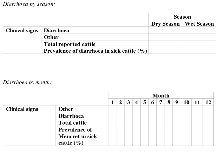
The contingency tables should look as follows.
Hint:
Use the demonstration video to complete the exercise and populate the contingency tables.
Does there appear to be a relationship between season or month and diarrhoea?
Exercise 12: Answer (contingency tables)
Paste your two contingency tables below and examine the relationship between time of year and diarrhoea.
Completed contingency tables for discussion.
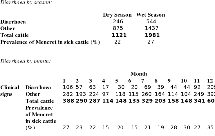
Below we have completed the contingency tables.
It appears that there may be a slight increase in the proportion of sick cattle that have diarrhoea in the wet season (27 verse 22%). It appears also that the prevalence of sick cattle with diarrhoea may increase during the year, with the middle dry season months having relatively low prevalence of diarrhoea.
However, results are very variable. Later we will use statistical hypothesis testing to allow more rigorous conclusions.
Plotting
It is very important to visualise the data in the form of plots since plots give a lot of information to the viewer.
This is important for the contingency table of month against diarrhoea. We will examine this data using scatterplots and lines of best fit in Excel. A scatterplot is used to plot data that has two variables associated with every observation. Usually, ordinal or continuous variables are required to plot data in a scatter plot.
Here, the prevalence of diarrhoea in all sick cattle presented for a month is one continuous variable (i.e. a percentage that varies from 0-100). We can plot months as an ordinal variable. This means we have an ordinal and continuous variable and we can therefore create a scatterplot with month on one axis (x axis) and prevalence of diarrhoea in sick cattle as another variable (y axis). This will allow us to examine the data and see visually whether the prevalence of diarrhoea cattle changes throughout the year.
Exercise 13: Question (plots of mencret prevalence by month)
Create a scatterplot of month against prevalence of diarrhoea in all sick cattle.
Hint:
Use the contingency table of month against Mencret above to populate the plot. Watch the demonstration video before attempting this.
Exercise 13: Answer (plots of mencret prevalence by month)
Include your scatterplot of month against prevalence of diarrhoea in all sick cattle below.
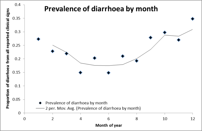
We have included the completed plot below (Figure 6). Some points to make on scatterplot design. The independent variable goes on the horizontal axis and the dependant variable on the vertical axis. The independent variable (month) is assumed to affect the dependant variable (prevalence). We need to include axis titles. We have included a line of best fit which here is a moving average. This plot helps by giving us more information about the relationship between season and prevalence of diarrhoea cattle. The line of best fit goes down in the dry season indicating there may be a relationship between diarrhoea and month of the year. The lowest prevalence appears to be in the dry season around months 4-8 with increasing prevalence in the wet season.
Figure 6
Notes: Key concepts of Measures of Disease
Step 4: Statistical hypothesis testing
Measure of association and hypothesis testing
There are two common ways of testing hypotheses using standard methods in veterinary epidemiology. This is with measures of association or statistical hypothesis testing. Here we will use a measure of association to answer our question. We will use a more traditional statistical hypothesis testing approach in the next case study (case study 3). In case study 3 we will also provide a comprehensive set of background knowledge notes to introduce the principals of statistical hypothesis testing.
In this case study we will establish a hypothesis, calculate a measure of association (and confidence interval) and interpret the results.
The question of interest here is whether there is a difference in diarrhoea prevalence between the wet or dry season. It is always important to first establish the null hypothesis. The null hypothesis is always the hypothesis of no effect. The null hypothesis is rejected or retained based on the value of the measure of association (and associated confidence interval).
Null hypothesis= Ho = There is no difference between the odds of diarrhoea between the wet and dry season.
The alternative hypothesis is generally opposite the null hypothesis. The alternative hypothesis is tentatively accepted if you have enough statistical evidence to reject the null hypothesis. Here the alternative hypothesis is:
HA = There is a difference between the odds of diarrhoea between the wet and dry season.
Exercise 14: Measure of association between Mencret and season.
Calculate a measure of association and confidence interval between diarrhoea and season.
Hint:
Calculate an odds ratio using the data from the two way contingency table of season and diarrhoea from Exercise 12.
We will be using Epitools for this exercise (http://epitools.ausvet.com.au/content.php?page=home). Please browse the Epitools website. Also, watch the video which details Epitools and how to use Epitools to calculate measures of association.
Exercise 14: Measure of association between Mencret and season.
Place your epitools results here.
Here we will calculate the odds ratio by hand to assist you in interpreting the exercise. Here is the contingency table.
| Diarrhoea | ||
| Other | ||
| Total cattle | ||
| Prevalence of Mencret in sick cattle (%) |
Odds of diarrhoea in the wet season:
544/1437 = 0.3786
Odds of diarrhoea in dry season:
246/875 =0.2811
Odds ratio:
0.3786/0.2811 = 1.35
We also know the 95% confidence interval is the interval 1.13 - 1.60. This means there is an association between season and diarrhoea. We thus reject the null hypothesis and infer that the alternative hypothesis is supported by the data: namely that season does have a role in the proportion of diarrhoea in passively surveyed cattle. However, it is important to note that this is simply a statistical association between the wet season and diarrhoea. It does not prove that the wet season causes diarrhoea. Instead it indicates that this may be possible. Further investigation and study would be required to determine that any factor actually causes disease.
Summary of case study 2
In this case study you again conducted several important steps in data analysis:
- An objective was presented to you
- You managed data (by backing up your original data, examining the data for errors and creating new data)
- You described data
- You conducted hypothesis testing using odds ratios and confidence intervals.
This time you described data by establishing contingency tables (called pivot tables in Excel) and by creating scatterplots and lines of best fit. These steps were almost enough to answer your research question of whether there was a change in diarrhoea between the wet and dry season. It appeared that there was a drop in diarrhoea in the dry season on the plot. We conducted some hypothesis testing using a measure of association and confidence interval to account for the effect of sampling variability so we could be sure what we saw in the tables and plots was most likely a real effect.
This is the end of case study 2.


